Boardable
Worked as a UX Designer, a remote job experience. Effectively collaborated with Growth and Engineering Teams. Re-designed Email Channels, Notifications and led customer research at a startup focused on the Non-Profits Board Management SaaS platform - (B2C)
Design Challenge(s)
The major project aimed to re-look at the current landscape of email channels within the platform and redesign them to deliver better profile management and email experiences. Also, I worked on sub-design projects in an agile environment.
MY ROLE
UX Designer & Researcher
TIMELINE
May 2020 - November 2020
TEAM
Abhinav (Myself)
Stacia Lowery (UX Designer)
Deborah Ojo (UX Design Intern)
TOOLS
Design
Sketch, Figma, Invision
Remote collaboration
Miro, Pragli, Monday.com, Slack
Research
Hotjar, Heap Analytics, ChurnZero, Hubspot
PROJECTS BY TIMELINE

We worked with a shape-up framework at Boardable

Board Member onboarding
Grassroots Plan Design
Meeting Video Feedback
Email Notifications Project
Research and Design Audit
Observed more number of dropouts in the sign-up process, Redesigned and optimized the onboarding process.
Aiming the new non-profit organizations and help them transitioning to paperless, organizing the board, plan meetings and collaborate remotely.
Designed a feedback mechanism to Remote Board meeting tool in Boardable platform.
Redesigned all the 41 transactional emails in the SaaS platform. Researched, analysed the processes and redesigned emails.
Managed user research by conducting interviews, Hotjar user activity, and presented a design audit report


Meeting Video feedback
Inspiration for the Design.
A couple of weeks after joining the organization, our engineering team launched a new remote video meeting feature for Non-profit Board members. The feature is great as board members can now meet virtually using the platform due to the COVID situation. But, the feature is in the beta version.
Problem Identification.
As it is in the beta phase, the board members started facing both technical and user-experience issues. This, in turn, raised support tickets. I got a chance to figure out the UX issues and identified a key problem "meeting video feedback loop is missing".
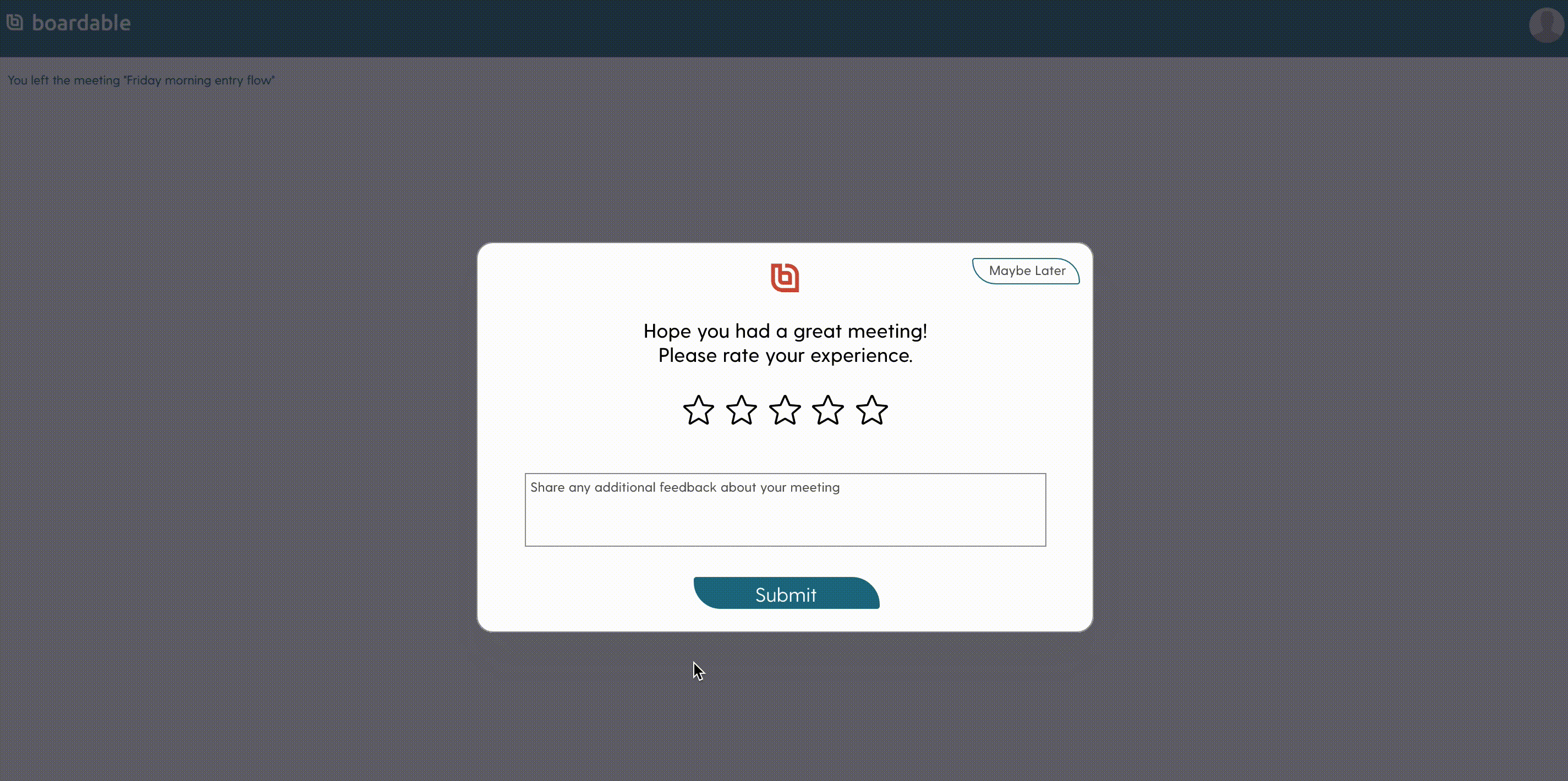
The Solution.
Soon after identifying the missing feedback loop, I created a wireframe with a five-star rating selection, feedback text column, presented it to the team. Considering the team's observations made the high fidelity designs in Sketch and handed-off to the engineering team.
Overall Impact.
The support team observed reduce in support tickets. The direct feedback increased the user's interaction and they were able to express their concerns soon after observing them. This improved the overall time to solve the bugs in the meeting video feature.
Key Takeaway.
Although the design reduced the support tickets, I understood that a dedicated person is required to track the feedback. I did it personally to understand users' concerns directly throughout my work period. I learned that implementing feedback loops is necessary, but a mechanism to monitor them is also equally important.
Board member Onboarding
Design Challenge.
There is a significant amount of friction to get a user to start a trial and for new users added to the trial to get into the product. The sign-up process has a 12.2% conversion rate and only 59% of added users accept invitations. Support requests for lost usernames and passwords are frequent*.
The Problem.
Currently, the admin and board member's onboarding process has a total of six steps to reach their dashboard. This has been impacting the overall signups on the platform. Which is impacting both the virality for the platform and increasing negative bias in users.
The Solution.
The solution is to introduce SSO and reduce the number of onboarding steps. We brainstormed as a team to come up with the list of existing steps, voted for the necessary fields with reasoning, steps, and reduced the steps to three. I suggested and implemented the "Goal gradient effect" which motivates the user the feeling of progress. Performed Usability testing, redesigned in Figma, and handed-off to the development team.
Overall Impact.
The overall conversion rate gradually increased by more than 50% than the existing values. The email invitation click-through rates have seen an uptick. With the introduction of SSO (Single sign-on), the password reset requests have significantly reduced.
Key Takeaway.
I learned that first impressions will affect users’ perception of aesthetics, usability, and credibility of a website[1]. To build pleasant and hassle-free interfaces, we need to look beyond rational thinking and design those instinctive processes that people engage in when they first use the product.
Email notifications Project
Design Challenge.
Each member in an organization works with a different set of information and the transactional emails play a crucial role in communicating the tasks, jobs, and important notifications. Currently, email notifications are have low click through rates (CTR), and open rates which is impacting the user enagagement.
The Problem.
Currently, there are over 40+ diverse emails being sent to different users from the Boardable App. These transactional emails are the only way to notify the users about their organization activity. The low CTR and OR's are observed as the emails are lacking in showing the exact call to actions (CTA's)
The Solution.
Redesigned the emails, provided templates with re-usable components across all emails. Provided a no-code solution to the team using storyblok. I redesigned all the 40+ email notifications by observing the user activities within the app, determined all the paths to trigger an email, designed the mock up wireframes and shared with the team to get an internal review, redesigned the emails in Figma, handed off the designs by components

My UX Design Approach.

Research phase 1
Collected 40+ Templates
Initially, worked with developers to get all the current templates. Segregated them according to different users by their activities which included signup, login, meeting invites, documents, polls, etc.
Explored Email Channels
Collecting existing emails gave me a brief understanding of all emails. Exploring how to send each email notification made me think of each trigger, required information in emails, CTA's from the users perspective.
Research Sample

Planning


Styles, Layout & Components
Designed the style guide for the emails, created layouts, and re-usable components in Figma. Parallelly, created low fidelity mock-ups to share with the team.
Redesigned Email channels
Redesigned all 40+ emails with intuitive CTA's, aligned necessary information, identified 3W's (Who, What, Why) for each email, followed the transactional emails best practices.
Design
Samples


A/B Testing
Performed A/B testing with few transactional emails to observe the user engagement. Interestingly we observed that replacing our Boardable logo at the header with the client's Non-profit organization logo gave a more personalized experience to the customers. This personalization of transactional emails was proposed as an add-on new feature.
Overall Impact.
The overall email open rates gradually increased by more than 30% than the existing emails. The email invitation click-through rates have seen an uptick. The user engagement through notification emails has improved.
Key Takeaway.
Implementation of transactional emails in any platform is different from marketing emails is the key takeaway from this project. Designing reusable components gave the developers and non-technical people the flexibility of implementing the emails in a much quicker way. I learned that Integrating designs to Email APIs and SMTP service is crucial for faster implementation.
Grassroots plan Design
Inspiration for the Design.
The growth team at Boardable has come up with a new plan for early non-profits. Helping these small organizations take their first steps in organizing board, transitioning to paperless, and utilizing tools to plan meetings and collaborate remotely.
Persona Design.
I helped the VP of growth by designing a user persona for the grassroots plan. This persona was presented at the internal board meeting to pitch the plan. Currently, Boardable has this plan, and new customers like Sarah(persona) have started using Boardable platform.

Design Audit

Inspiration for the Design.
Working in a startup environment is exciting, the team gives the flexibility to explore to the best of one's ability. Working on the email notifications project gave me the chance to explore every nook and corners of the Boardable SaaS platform. I tried to best utilize the time by not just looking at the UX processes for transactional emails, but started to work on an audit document that covered most of the current functionalities which are lacking in a better UX approach.
This is a sample of the UX design Audit ( Under NDA)
Testimonals

Ieshia Hill
PM Associate at Boardable
(Growth Team)
- Abhinav made a significant impact on our team as a UX designer. From conducting extensive research and customer interviews, creating new and data-driven user interface designs to working closely with the development team to improve the UI of our current and future products and features, constantly adapting to change, and working at a fast pace to meet deadlines on multiple projects. Abhinav will be a valuable addition to any organization.
Thanks for reading! Let's explore more of my work!